Manipulating Antibody-Virus Interactions via Machine Learning

Unlocking Unlimited Data

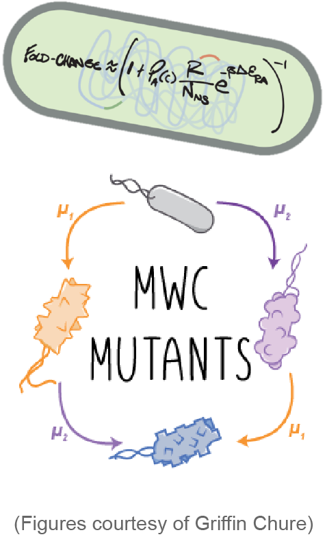
"Do not underestimate the seductive power of math." - Rachel Hartman

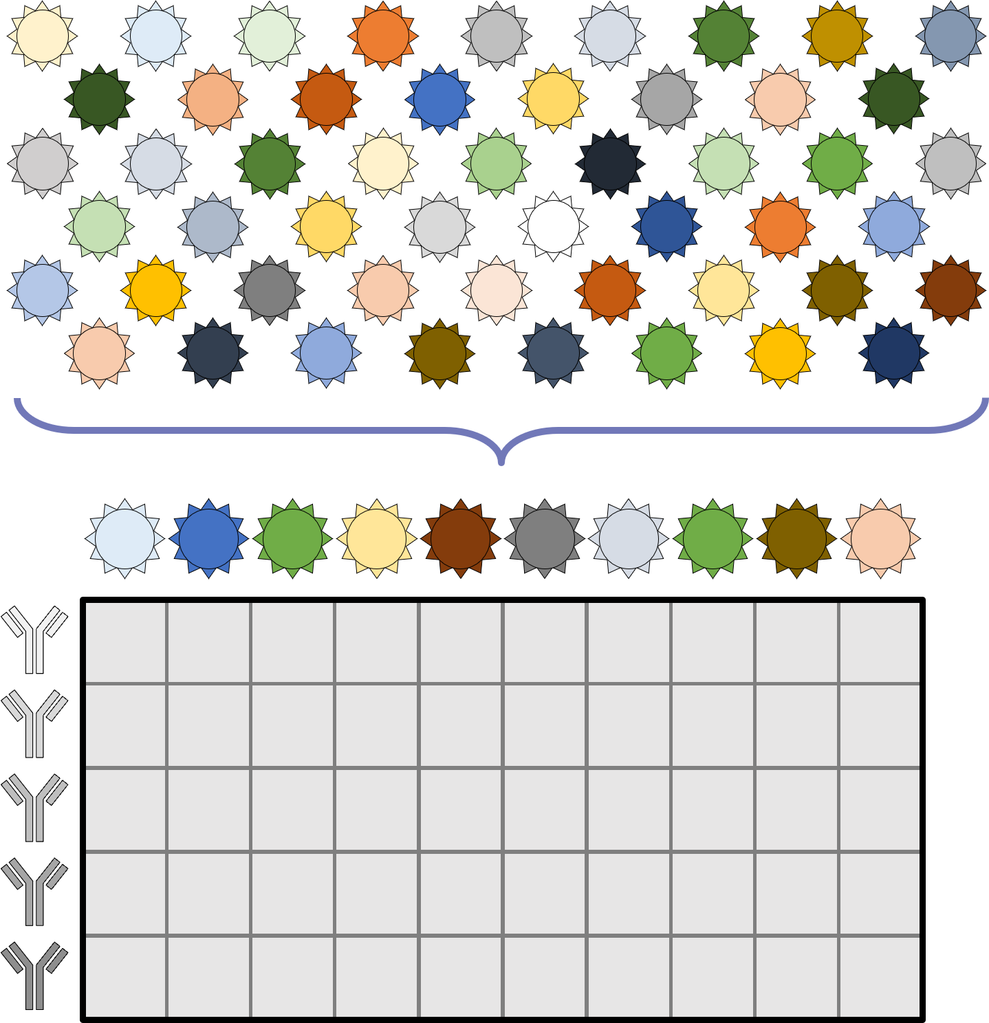
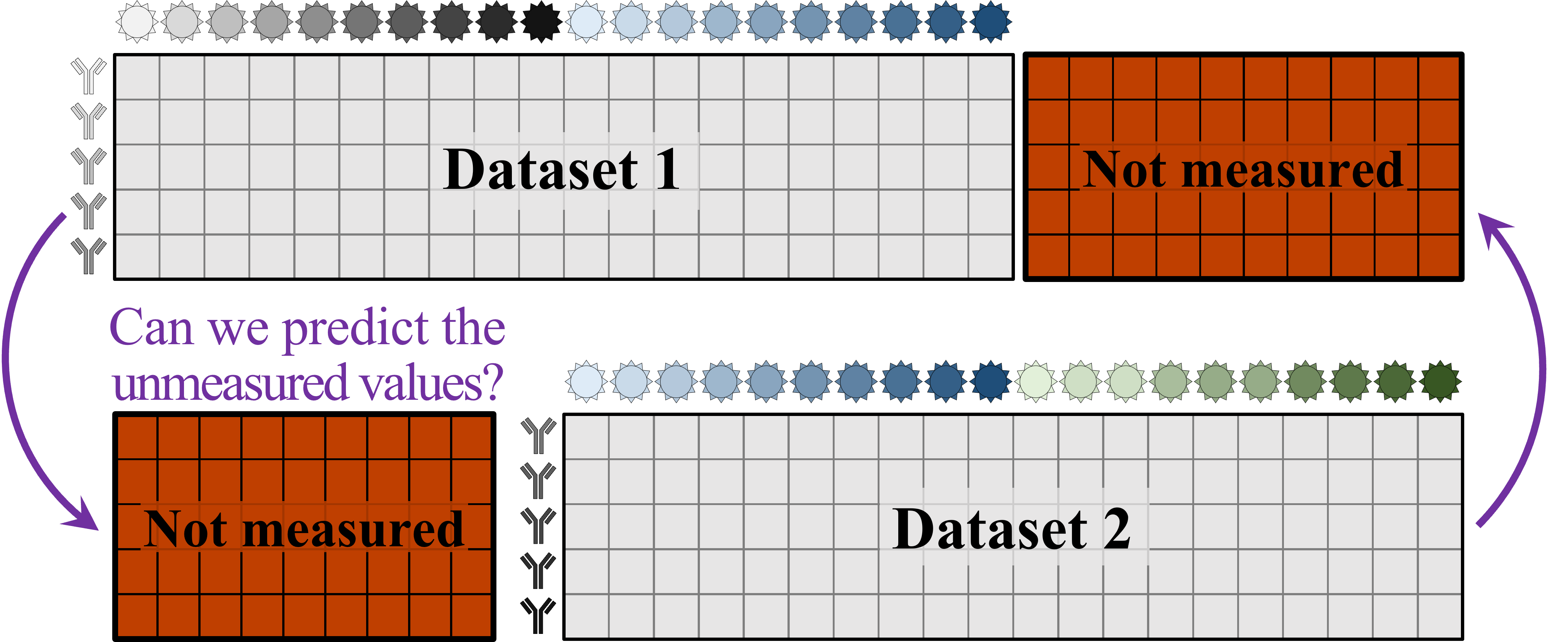
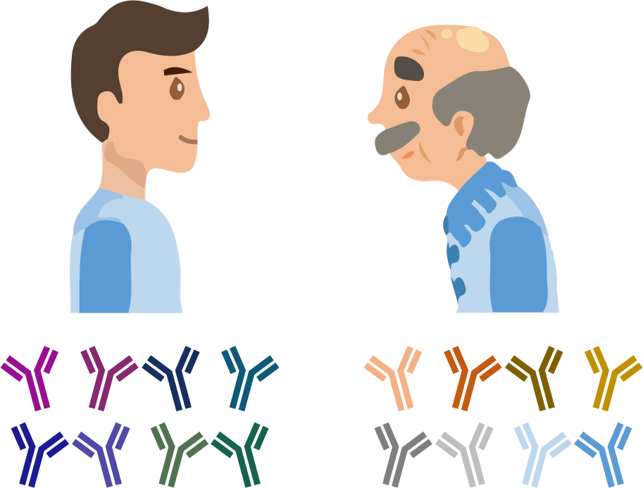
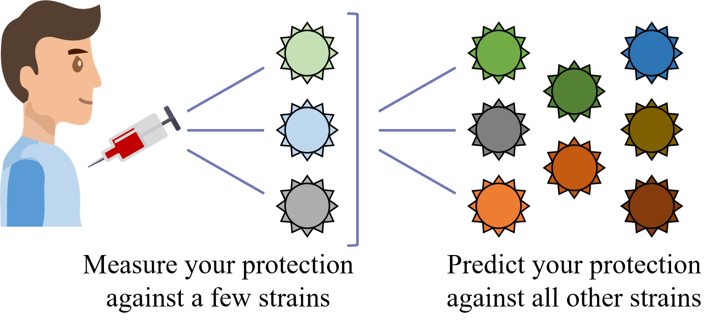
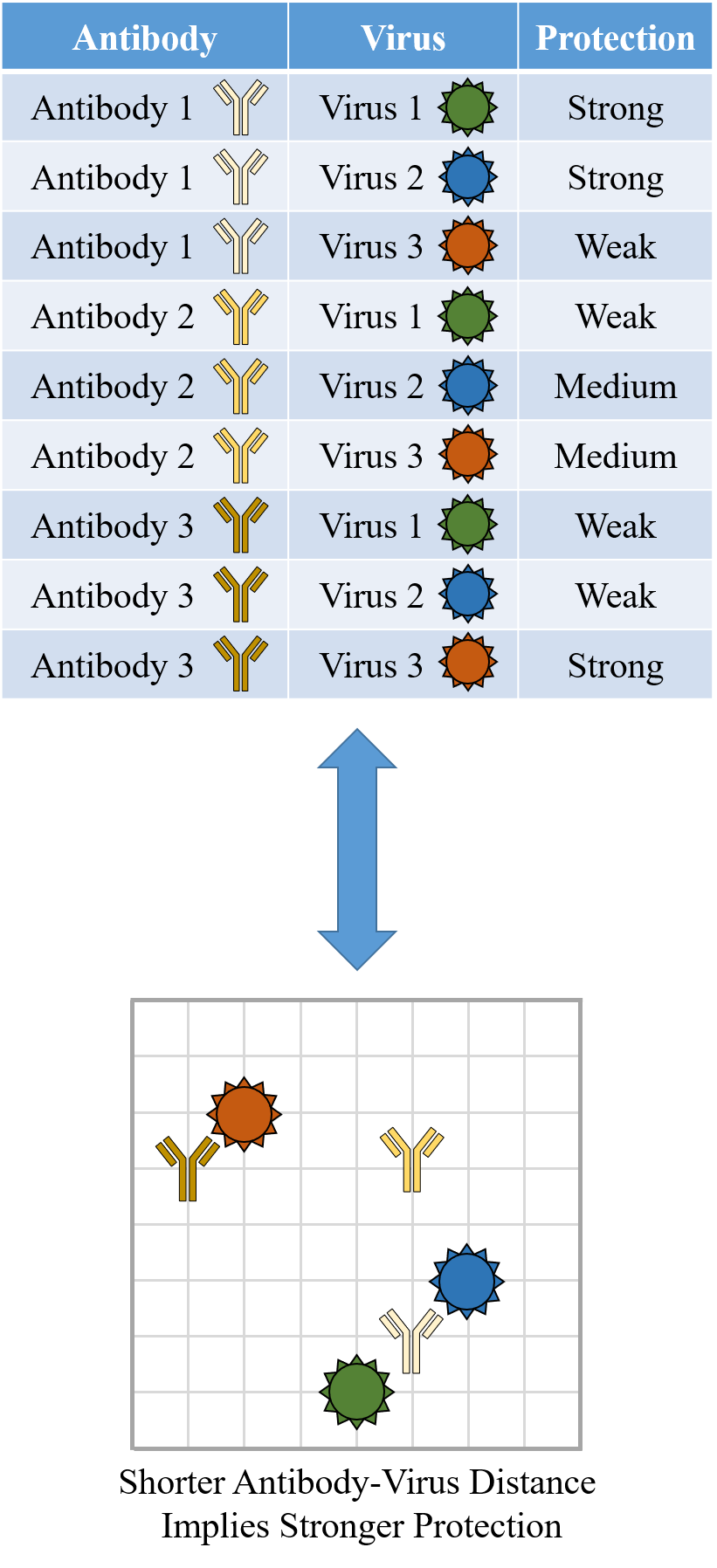
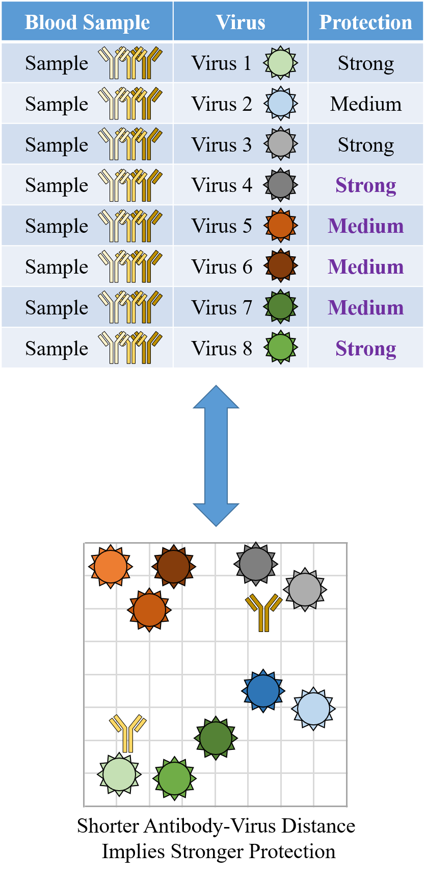
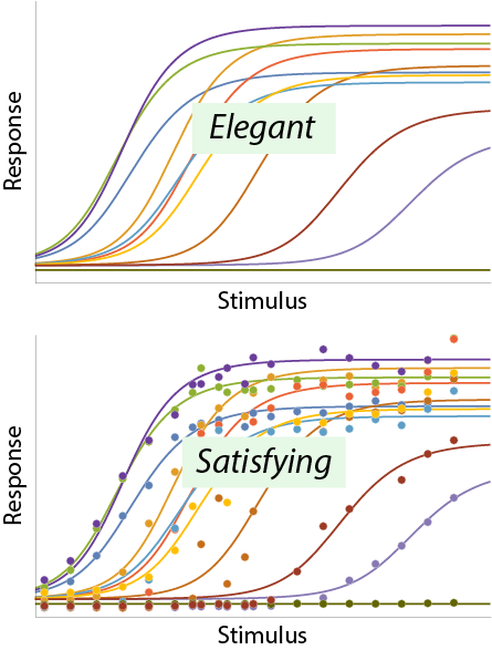
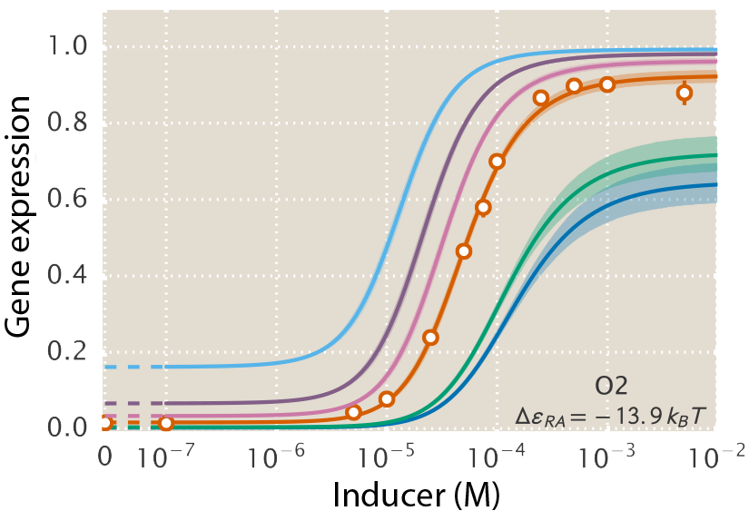
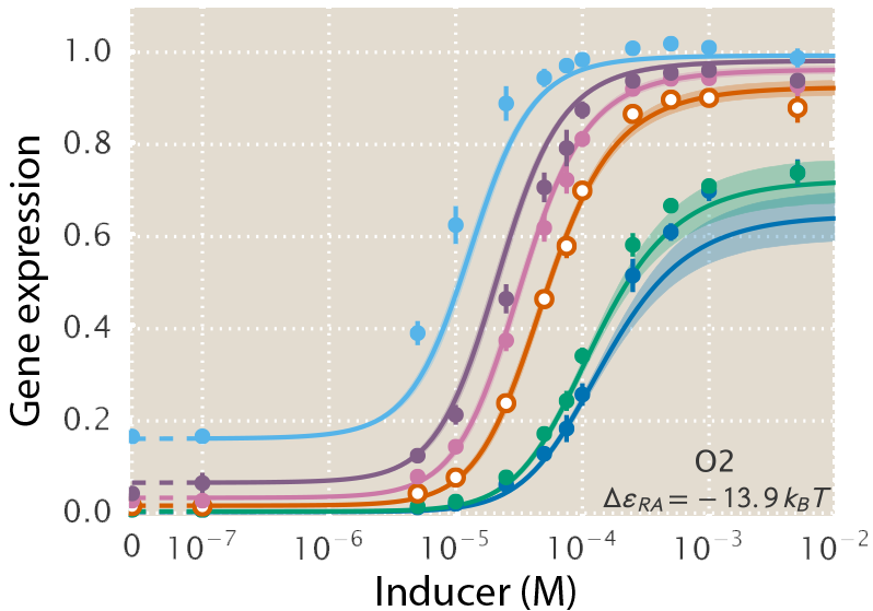
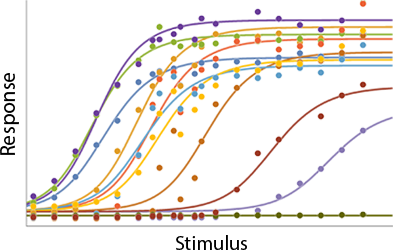
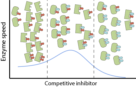
A central goal of immunology research is to elicit a potent antibody response that inhibits as many viruses as possible, ideally leaving a virus with no opportunities to mutate and escape. Experiments often measure how antibodies inhibit dozens of different viruses.

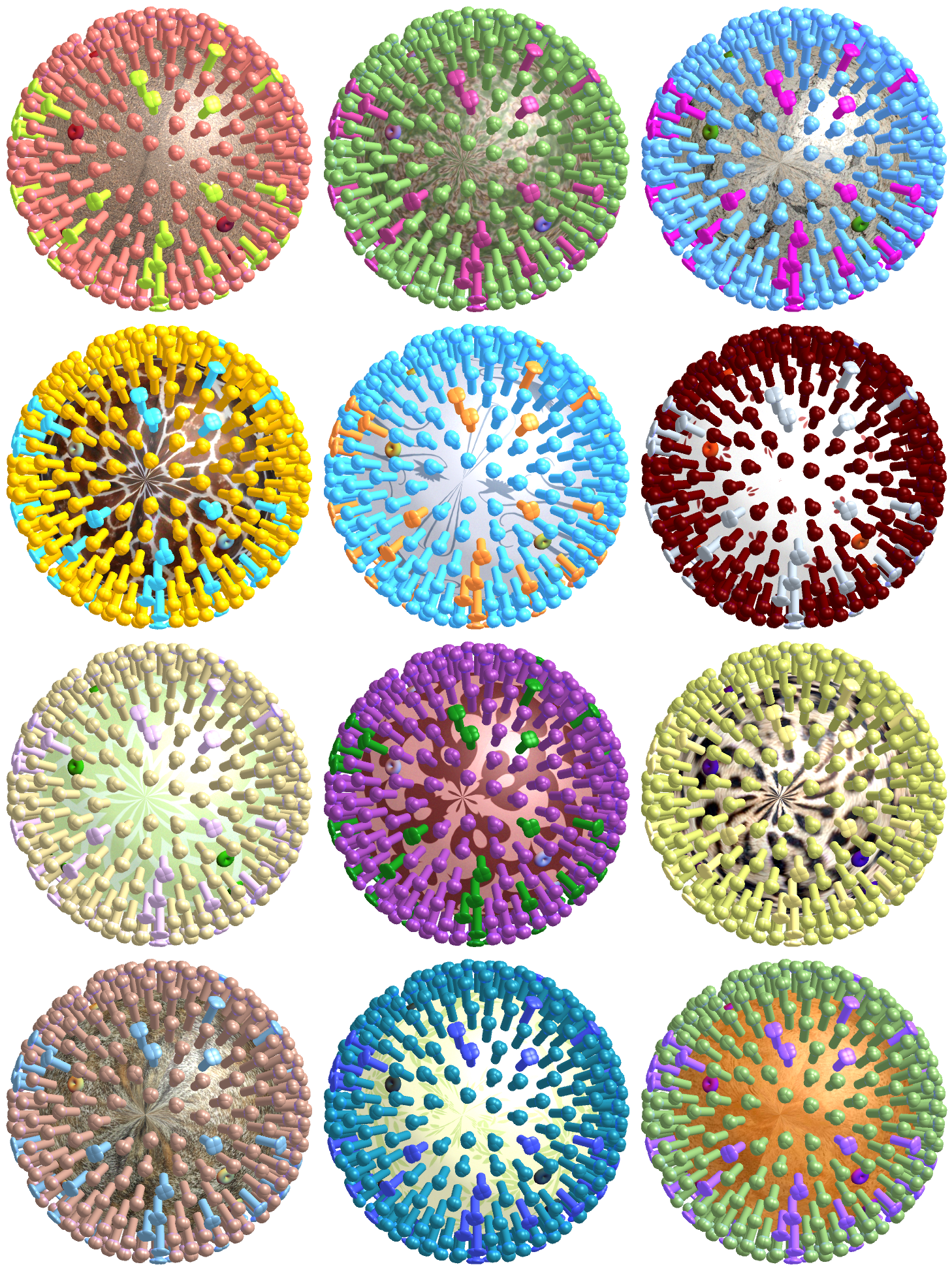
Unfortunately, this constitutes a tiny fraction of all possible viruses - each year hundreds of new variants emerge and join the worldwide melee. When researchers seek antibodies that comprehensively inhibit the whole gamut of viruses, they often choose variants that have little-to-no overlap with other studies. This makes it difficult to compare antibody responses across studies, and each dataset ends up being analyzed in isolation.

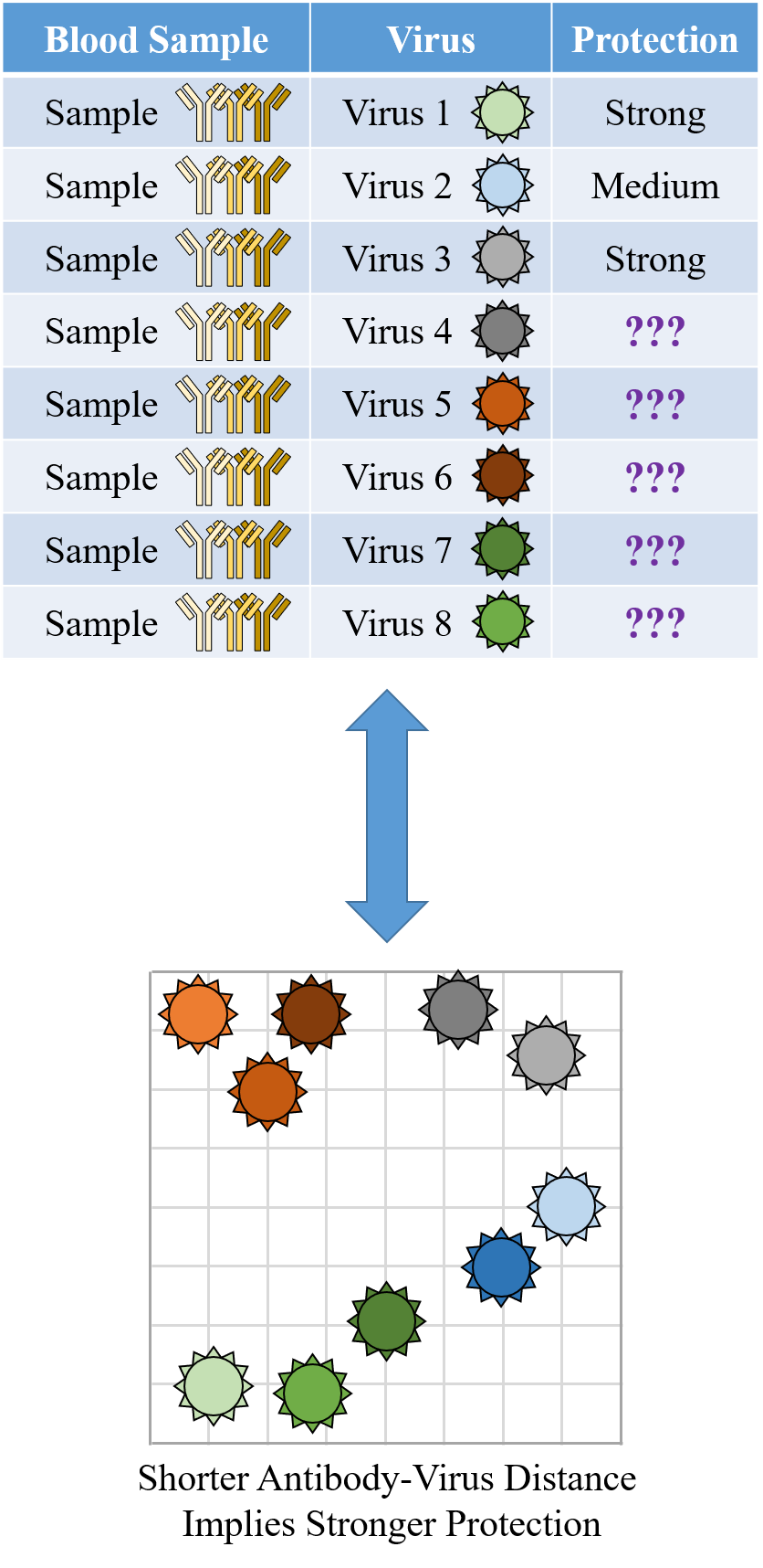
What we need is a framework that learns the underlying patterns in the data and extrapolates how every antibody would inhibit each virus. Is this possible...?

Indeed it is! By combining data, we can predict how the antibodies in one dataset would inhibit the viruses from any other dataset. With this mindset, the different virus panels in each study are not a weakness, but rather an asset allowing us to better explore the space of possible viruses.

The implications are huge - each experiment takes significant time and resources, and by combining datasets we can massively expand the number of measurements, often by more than 10x, without any additional work!

Of course, things are not that easy. Biology is riddled with anecdotes highlighting how tiny differences in a protocol can lead to dramatically different results. Even without such errors, there is immense diversity among antibodies, so the patterns of virus inhibition seen in one dataset may not be reflected in another dataset.

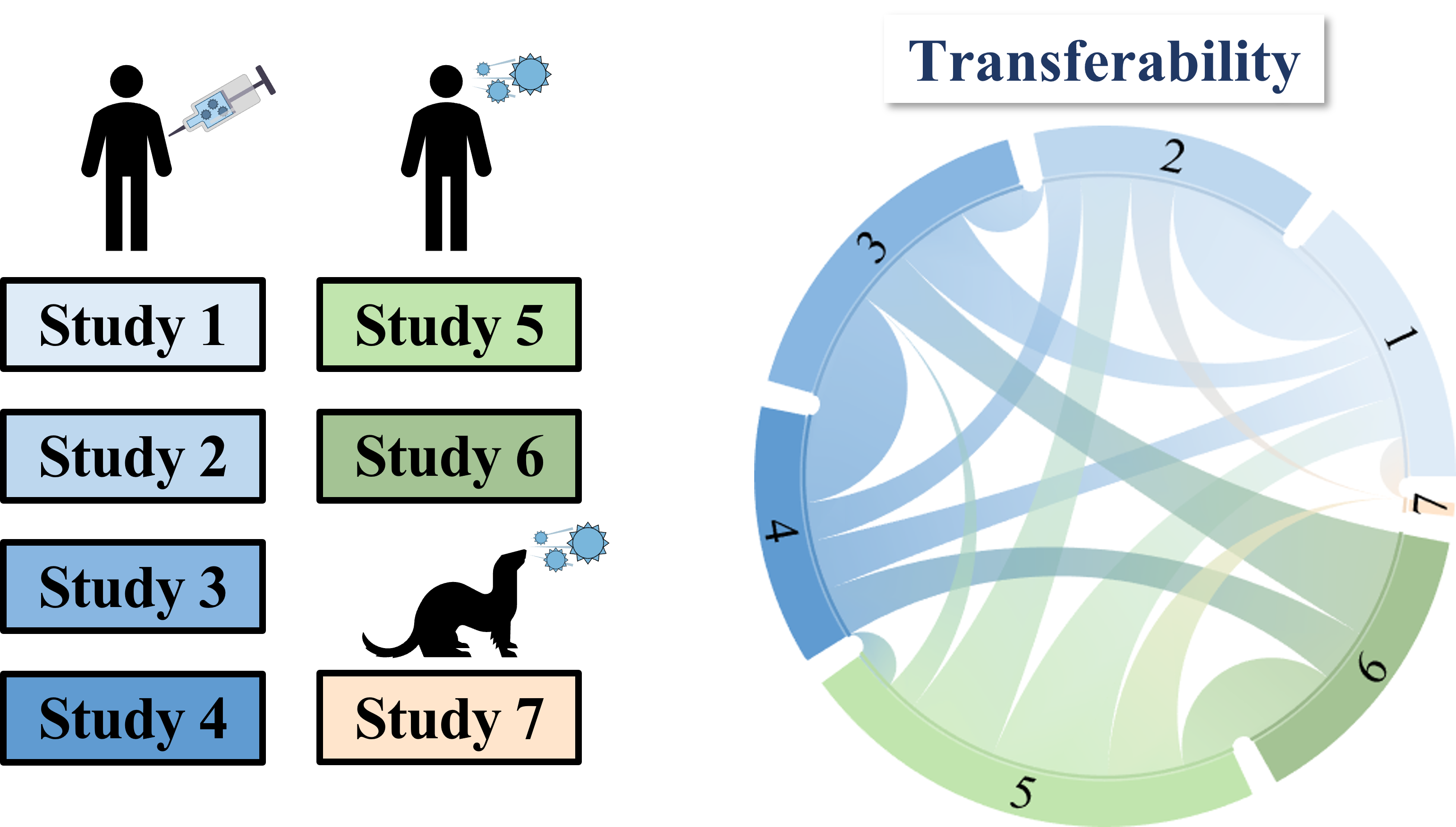
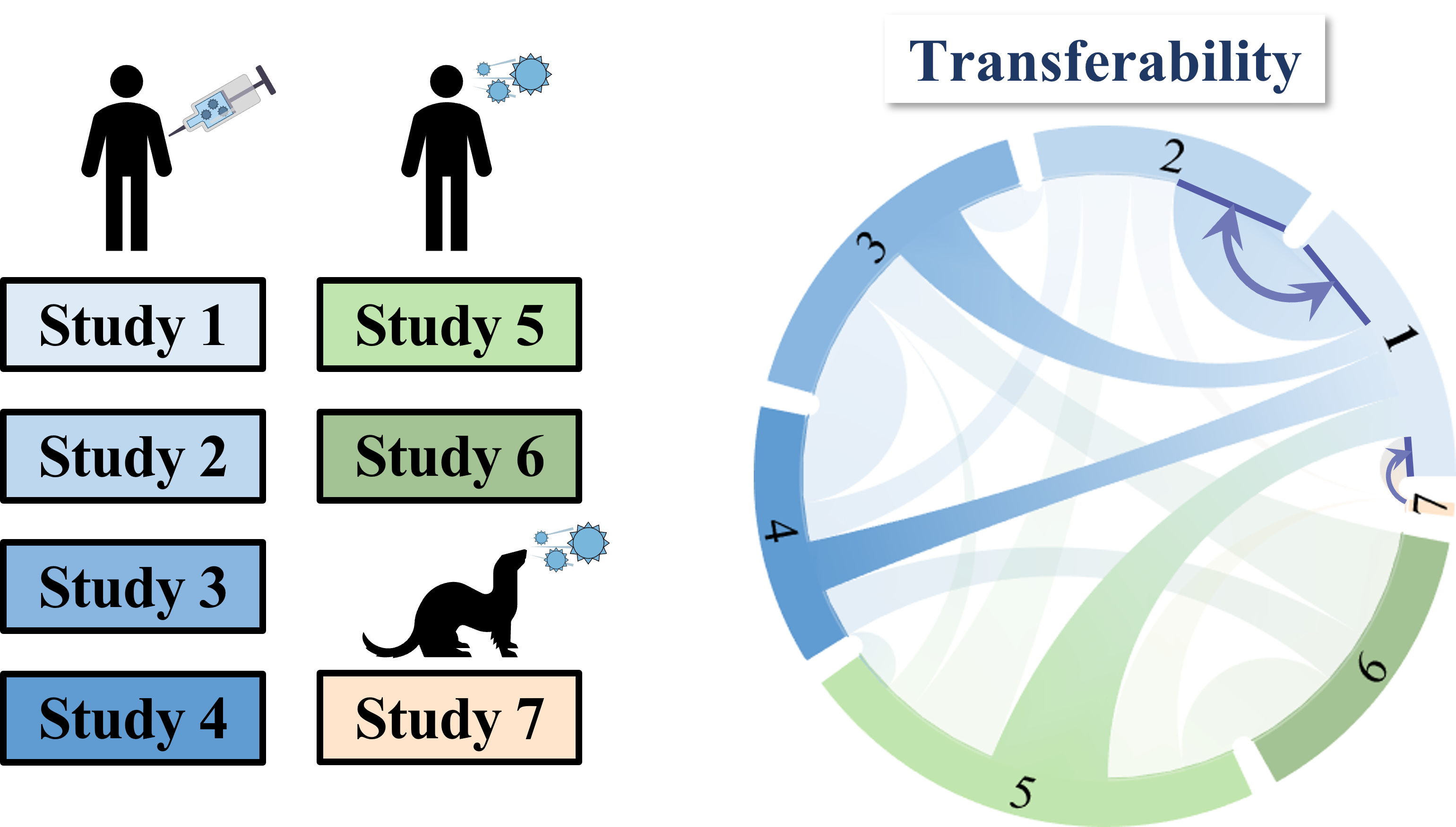
To overcome this difficulty, we develop a machine learning algorithm to quantify the transferability of information between two datasets. In other words, how does the behavior of viruses in one study inform the behavior of viruses in another study? We display the transferability using a chord diagram, which is visually striking but a bit tricky to interpret the first time you see it. So let's look at one specific study...

Each band in the diagram represents a double-sided arrow, where a thicker band implies greater transferability. Study 1 is highly informative of Study 2 (and vice versa), whereas Study 1 and 3 are less informative of one another. Ferrets (shown in Study 7) turn out to be very different from humans, and we need to understand these relationships more deeply, since influenza surveillance is conducted using ferrets.

One surprising result was that human vaccination studies (shown in blue) and human infection studies (green) can have high transferability, even though the participants in the infection studies had never received an influenza vaccine in their life! By quantifying the transferability between datasets, we can determine which factors (such as age or infection history) give rise to distinct antibody responses, and which factors don't matter.

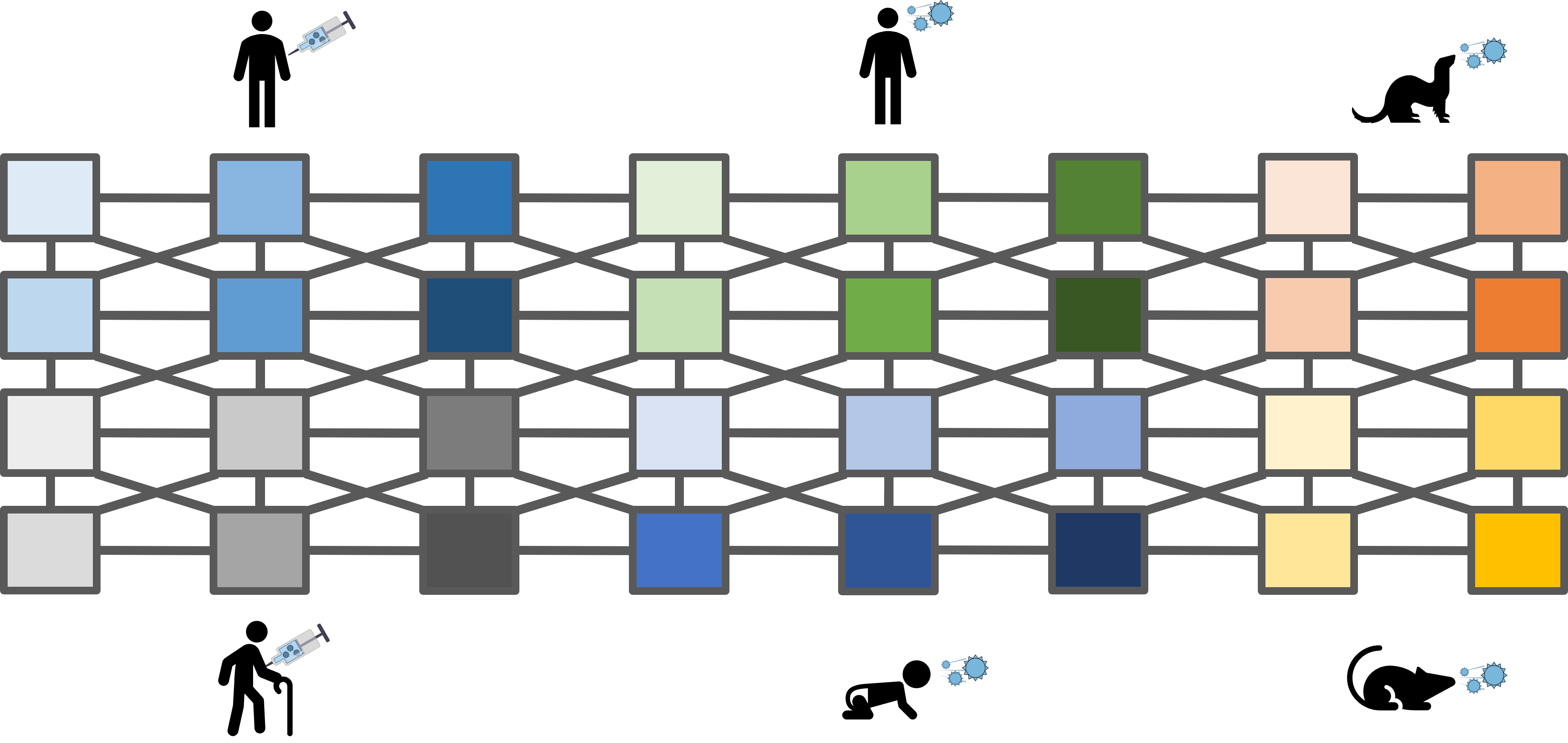
Of course, this is just the beginning. The power of this approach is that as we add more datasets, they are expanded by previous studies, but they also expand those studies in return. Thus, we grow a network that embodies the full extent of our knowledge on antibody-virus interactions.

This data-driven approach can be readily expanded to other viruses, or more generally to other low-dimensional datasets. I predict that the main limitation of these methods will be in how creatively we will apply them. If you have any ideas, or are simply excited by this approach, feel free to contact me and I would be happy to discuss this "mathematical superpower." You can also read our manuscript for more details.

Making Maps and Splitting Serum

"Still round the corner, there may wait, a new road or a secret gate." - J. R. R. Tolkien

When we get infected by a virus, we generate a vast array of antibodies to clear the infection. While most of these antibodies are ultimately degraded, a subset stick around as memory cells in case we encounter this same virus in the future. Hence, each of us has a unique antibody repertoire based on our specific infection history.

This brings us to a key question in immunology: What protection do your specific antibodies offer?

To be concrete, consider flu. Each year, hundreds of different strains of this virus circulate around the world and infect millions of people. This year, will you become sick from one of these viruses, or will your antibodies protect you?

This question is surprisingly difficult to answer! Although our blood contains all of our antibodies, it is effectively a "black box." To separate out and characterize each antibody would require years of effort (by which point your antibody repertoire will have dramatically changed). In other words, our blood contains an unknown number of antibodies, and the protection offered by each of them against any virus strain is unknown.

Nevertheless, we can measure the collective protection from all the antibodies in your blood against different flu strains. But since each measurement requires some of your blood (an inherently limited commodity), we can only assess your protection against a few viruses, and from these measurements we must predict how you would fare against all other strains. But how can we possibly answer this question when we do not know the composition of your antibodies?

My answer was to create a "map" of all possible antibody-virus interactions. The example data on the right quantify the protection of three antibodies against three viruses. These nine interactions are mapped onto the grid shown below, where antibodies that strongly protect against a virus will lie close to it on the map (within 2 grid units) whereas antibodies that offer weak protection lie further away (more than 4 grid units). See if you can convince yourself that the table of values matches the map results.

The power of this approach becomes apparent when we scale up the numbers. Each year, hundreds of different viruses are assessed against hundreds of different antibodies. Rather than looking at a spreadsheet containing ten thousand values, we can create a map that allows us to quantify and visualize the key players. But perhaps the most useful application of these maps is in the ability to decompose any antibody repertoire.

Suppose that we have created a map of all the flu strains circulating this year (shown below on the right). To quantify your level of protection, we take a drop of your blood and measure its ability to inhibit a few of these viruses (e.g. the light-blue, light-green, and light-gray strains). Using just those three measurements (shown in the table), can you guess how protected you will be against the remaining viruses?

Take a moment to think this through. Remember that we do not know how many antibodies there are within your blood, but we can translate the information that we have into our map. Strong protection against a virus means that there must be an antibody nearby. So where would you predict your antibodies reside on the map? And given their positions, can you predict your level of protection against the rest of the viruses?

At minimum there must be antibodies near the light-green and light-gray viruses, and with this information you can predict (a lower bound for) your protection against the other viruses. Granted, there may be more antibodies lurking in other regions of the map, but our ability to detect them grows with the number of measurements we have, and such antibodies would only increase your protection.

Our ability to say so much using only a few measurements is remarkable, given that we did not know how many antibodies there should be nor their individual protection profiles! So where did the information come from...? It came from the positions of the viruses on the map. An antibody can inhibit two viruses that lie close to one another, but not two viruses that are far apart. Thus, when your blood strongly inhibits two dissimilar viruses, we know that at least two antibodies must be at work.

This approach provides a new tool to peer into our immune repertoires and characterize our individual antibodies - something that I had considered impossible a year ago. This work has opened up an array of fascinating questions such as: How do our antibodies move along the map with each infection? Can an antibody be "guided" to a specific location? Given your specific antibodies, which vaccine strain would best augment your protection? Like any innovation, this one opens up many new and exciting roads that I cannot wait to travel!

Influenza by the Numbers

"Knowing the key numbers governing a biological process is akin to a scientific superpower." - Rob Phillips

For my postdoc, I decided to shift lanes and apply my biophysics training to the realm of disease research. I joined the lab of Jesse Bloom to study how the influenza virus (a.k.a. flu) can evolve to escape from the antibodies that circulate within us.

In preparation for my postdoc, I read Janeway's Immunobiology textbook which impressed upon me the exquisite complexity of our immune system, yet when I began my postdoc I still knew very little about flu biology. This meant that every week someone would blow my mind with a crazy fact about the global dynamics of flu, transmission bottlenecks, or vaccine effectiveness...in short, I was having a blast!

To get myself oriented, I asked basic questions such as "How big is a flu virion?" and "How long does an infection typically last?" Regardless of the question, the most common response was, "It depends." I appreciated that answer - after all, humans are highly complex, and in my graduate studies I learned that even the behavior of individual bacteria can vary greatly, even though the population average was often tightly constrained. But when I pressed my colleagues for the typical range of values, no one seemed to know these numbers off the top of their head.

This response embodies a philosophical difference between biology and physics. Biology embraces the unique and breathtaking complexity of life, and the breadth of phenotypes is often of greatest interest. Physics promotes simple and unifying models, which can quantitatively describe key aspects of a system, but which might ignore some of its more nuanced behavior (think of the spherical cow analogy). Whether this tradeoff is worthwhile might be a matter of taste, but it explains why physicists yearn for key numbers in order to build quantitative models.

For example, notice that the influenza virion shown on the left is covered in teal and pink spikes. If you know the dimensions of the virus and the number of spikes, you could determine the nearest neighbor separation between adjacent spikes. Why is this an important number? It turns out that although antibodies often bind to the top of these spikes, the most sought-after antibodies bind to their stems (which are more conserved across flu strains). Given the average spacing between spikes, is there room for a stem-targeting antibody to bind to the stem of a spike?

Let's follow these questions through. The 2D pictures on the left show that viruses have a variety of shapes. Most of the viruses used in experiments are spherical, although the long and narrow morphology is believed to help a virus infect humans more efficiently. For spherical viruses, the mean diameter is typically 125 nm (including the lengths of the spikes on either end).

Given that there are 350 spikes spread uniformly on the surface of a virion, you can compute that the average separation will be 10 nm between nearest neighbor spikes. Since the width of an antibody is 15 nm, it will be a tight squeeze for it to bind to a spike's stem - it is possible, but the antibody will have to align itself just right. Indeed, squeezing into this tight slot reduces stem-antibody binding by about 10x.

This tight packing naturally leads to more questions. Is there enough room for every spike to be simultaneously bound by a stem-targeting antibody? If not, how are these antibodies able to stop a virus without binding to all spikes? Could it be that only a subset of spikes need to be bound in order to prevent the virus from infecting our cells? All of these questions are surprisingly understudied, and they are all motivated by some simple calculations that are only possible once we know some numbers.

To answer these types of questions, I read broadly on many aspects of flu biology, gathering numbers from all contexts. How many virions are produced during an infection and how many of our cells do they destroy? How many antibodies do we produce when we get infected by flu? How can we quantify the protection offered by our antibodies?

As I gathered these numbers, they naturally coalesced into different sectors of flu biology. As a fun mini-project, I put together a 1-page graphical illustration (published as a Cell SnapShot) that highlights the key numbers underlying an influenza infection and our antibody response against the virus. This SnapShot is targeted at influenza researchers who are specialists in one aspect of flu biology but would like a 30,000-foot view of some of its other characteristics.

One of the reasons I loved this project is that it melded my skill sets in science and illustration. Each of the figures was either created programmatically or was drawn from scratch in Adobe Illustrator. Feedback from my artistically-inclined colleagues led to me to think hard about the various aspects of graphical design from the iconography to the color palette.

As a fun example, the influenza virion in the center of the SnapShot was made in Mathematica, which meant that we could generate hundreds of variants and choose the one that looked the best. The pictures to the left display some of the most interesting virions that emerged!

As with any project, this one could not have been done without the help of many colleagues. I spent hours discussing the content and layout with Lauren Gentles, a terrific graduate student in our lab, and Jesse Bloom's feedback was instrumental in ensuring our scientific accuracy. You can find the final version of the SnapShot, representing all of our collective hard work, at this link.

What is it like to do a PhD? Reflections on the Past Five Years

"The best thesis defense is a good thesis offense." - XKCD

I loved my time at Caltech. Every day was an extraordinary gift, and while it is impossible to distill five years' worth of transformative experiences and personal growth into a few paragraphs, I want to highlight several key components that made my experience so overwhelmingly positive.

One of my favorite aspects of graduate school is that your knowledge base grows exponentially. The first year of grad school is spent trying to figure out the basics: how do you make figures, collaborate with others, or iterate on a paper with your advisor. Three years later, things that previously seemed impossible click into place and you crank our papers. By the time you graduate, you are dragging your advisor and collaborators along in the wake of your excitement to blaze new paths of research.

One of the most surprising aspects of my PhD was how closely each of my projects revolved around experiments. I entered graduate school as a theoretical physicist expecting to work on esoteric mathematical models, yet the direct connection with data provided a window into the exhilarating world of biology.

While I have never physically manipulated these biological systems in the lab, my models allow me to push and prod and examine their behavior from the most mundane to the utterly extreme limits. The pace of biological research continues to grow at a staggering pace, and the field needs models that harness the incredible wealth of hard-won data to weave a few more threads of understanding into our tapestry of how these incredible living systems operate.

The hardest part of grad school was working with experimentalists. But the best part of grad school was also working with experimentalists! When I did my first, truly joint theory-experiment project, I quickly realized that experiments...take...time. Whereas a theorist can promise to complete a section of a paper by a certain date (come hell or high water), doing careful and robust experimental work may require you to start over, again and again, for months!

Every problem can be broken down into a number of steps, and every step is trivial for the right person. The key to a good collaboration is to choose the right set of people that cannot solve a problem individually, but that can crack it together. A theory/experiment partnership provides a clean example, but collaborations between multiple theorists or multiple experimentalists often unlock beautiful new avenues of research. My own experiences attest that the result of good collaborations is a piece of work of far greater quality than what I could have accomplished on my own.

Writ large, there are two overarching goals that pervade my dissertation. The first is to translate our biological knowledge into concrete physical models, enabling us to quantitatively describe how the key molecular components in each system interact to carry out their function. The second goal is to analyze how mutations can be mapped into the fundamental biophysical parameters governing each system.

As you read through the projects on this page, I pose to you the following question that my advisor Rob Phillips asked throughout my PhD: "When is a model good enough? When should we declare victory?" My answer has been that theory must push our understanding of a system until we uncover a jaw-dropping conclusion. While this criterion obviously depends upon the spring constant of your particular jaw, it emphasizes that simply drawing a curve that fits the data is not enough. A successful model should give intuition into a previously unexplained phenomenon, provide a mental map with which to contemplate new experiments, and significantly accelerate the pace of research. Each of my projects aim to fulfill these criteria. Collectively, I hope these works demonstrate how the melding of theory and experiment creates a whole that is far greater than the sum of its parts.

Universities are very special places. Few other institutions will hire people whose job is to increase students' well being, and I enjoyed tapping into the bountiful offerings. For example, every term I took a fun class (such as silk screening or improv), and each time I was blown away by the passion and commitment of the teachers.

Halfway through my PhD, I painted a picture of my mom for her birthday, and I asked Jim Barry (the art teacher) if he would help me reveal it at the end of the term when my parents would visit campus. He happily agreed, and when my parents arrived he first gave us a grand tour of the Caltech Art Chateau, after which he showed my parents the 3D virtual reality drawing program on the Oculus Rift (where you can literally peer into a drawing). Then, right as they removed their headsets, Jim had me present my own work, beautifully framed and with the perfect lighting. My parents were astounded (and immediately asked Jim if he had secretly drew the piece!). To this day they vividly remember that trip because of Jim.

The magic of Caltech is that such moments happen surprisingly often with your friends and colleagues - when you interact with a small group of people in many different capacities, you forge deep connections. In one day, I may teach someone physics, dance hip hop beside them, and then eat dinner together.

During my second-to-last year at Caltech, I took a Storytelling class with my friend Heidi Klumpe (a biology graduate student and fellow dancer), and I was blown away by the elegance and creativity of her writing. Getting to glimpse such hidden talents is a privilege, and Heidi made what was already an excellent class an unforgettable experience. One year later, she asked if I would be willing to be interviewed for a new Caltech podcast series called Not My Thesis that explores the lives of PhD students at Caltech. I happily agreed, and I was amazed by the passion and skill that Heidi invested into this project. Thanks to her efforts, you can listen to some of my favorite anecdotes from my time at Caltech and hear other accounts of what it is like to pursue a PhD.

Induction of Transcription Factors

"The test of a scientific theory is, I suggest, its fruitfulness." - James Conant

Any experimentalist will tell you that there is variability in science, regardless of whether you are measuring the voltage across a circuit element or the protein production in a cell. Yet compared to physics, biology is a "squishy" science. By necessity, biology experiments can never be conducted at extremely low temperatures or on a single, simple component of a system. Instead, even the simplest biology experiments work with incredibly complex organisms, trying to understand how their myriad parts weave together to generate a cell's complex behavior.

So this naturally begs the question: just how quantitative can biology be?

We explored this question in the context of transcriptional regulation, when DNA is read in order to produce protein. Many aspects of this fundamental process have been extensively studied, and the main players are shown on the left.

Polymerase (light blue) binds to DNA and initiates transcription, the first step in transforming this segment of DNA into a protein. When more polymerase is present, transcription will happen more often, leading to increased protein production. To slow down expression of this particular gene, a cell can produce a repressor (red) which can only bind to this specific gene. The repressor competes with the polymerase for the same binding spots on the DNA, so that when the repressor is bound polymerase will not read this DNA.

But cells also respond to their environment, which introduces another level of regulation. A small molecule called an inducer (small blue circle) can bind to the repressor and inactive it, so that the repressor is no longer capable of binding to the DNA. The benefit of having these multiple layers of regulation is that it enables cells to respond on different time scales - cells can quickly change the local concentration of an inducer in order to inactive repressors in minutes, but reducing the actual number of repressors can take hours. One of the best studied examples of an inducible system (and the one that we ran our experiments on) is the Lac repressor in E. coli: the gene contains enzymes to digest the sugar lactose, but this gene is normally silenced by a repressor except when lactose (the inducer) is present.

While the interactions between these molecular players are qualitatively understood, there is no quantitative framework that can predict exactly how much gene expression will increase when the number of repressors are, say, doubled. Fueled by this challenge, we formulated a model for this system using a combination of statistical mechanics and thermodynamics. But we quickly ran into a problem - because this system was never quantitatively studied, many of the necessary parameters (such as how tightly the inducer binds to the repressor or the repressor binds to DNA) were unknown.

To that end, we took data on a single strain of bacteria in order to characterize all of the parameters of the system. After that, we had the keys to the kingdom. We could predict exactly how the system should behave in any other setting. For example, it is experimentally straightforward to tune the number of repressors in a cell. So using our single data set (orange circles), we predicted how other strains should behave. And then came the real question: will our predictions accurately portray the behavior of our system?

Before showing you the result, it is worth stressing once again that these predictions were made based on data from a single strain, before we constructed and measured any other strains. This is a prime example of theory leading the way to make strict predictions that are either carried out or disproved by experiment. This is quantitative biology at its best.

And for readers with a strong statistics background, the shaded areas represent the 95% credible region using Bayesian model fitting.

In total, we created 18 different strains of bacteria (6 of them are shown on the left) to test our framework under many different experimental conditions. In each case, the data matched remarkably well with the predictions!

This benign-looking data set represents a huge experimental effort. Each of the 72 data points is the average of eight different experimental runs, with each run analyzing over 40,000 cells. The whole procedure took several months to carry out experimentally - in contrast we fleshed out the theoretical framework over the course of a few weeks. That is not a dig on experiments. Rather, this difference in time scale demonstrates how important it is to be able to explore a system theoretically.

Amusingly, once we started to present these results to other professors, we began to get feedback such as, "Why don't the dark blue data points lie exactly on the line? They seem to be off by about 10%." And this led to an impromptu conversation among the professors in the audience, many of whom had the opinion that biology, being a nascent field, is a "factor of 2" science where you are lucky to have a theory that matches your experiment to within a factor of 2. As the field develops, more exact theories will surely arise that minimize the small discrepancies between our theory and the data, yet it should be appreciated that before our paper there was only a qualitative understanding of inducible gene regulation, and the plot on the left represents a significant boost in our ability to model such systems.

The fantastic consistency between our theoretical predictions and experimental measurement does not spell out the end of the story. Rather, it provides justification that our theory is correct, so that we can now begin to explore transcriptional regulation theoretically (which is orders of magnitude faster than exploring it experimentally!). We can now make quantitative statements about the effects of the physical parameters governing the system (such as the binding strength between the repressor and inducer) and explore all of the possible phenotypes that a cell can exhibit. The data shown on the left is just the tip of the iceberg. This experiment has paved the way for a truly exciting possibility of quantitatively exploring the effects of mutations in the context of transcriptional regulation (see below).

More details about this work, as well as the full data set and analysis notebooks (in both Python and Mathematica) may be found at this dedicated website.

Mutations from a Thermodynamic Perspective

"Everything must be made as simple as possible. But not simpler." - Albert Einstein

Proteins facilitate nearly every cellular process. A typical protein is built up of 300 amino acids, and in bacteria there are 20 different amino acids to choose from. Thus, the number of possible proteins is greater than the number of atoms in the universe (raised to the fifth power!). It is impossible to experimentally test any significant fraction of these proteins, so how can we explore this overwhelmingly large space as we search for new drugs, create synthetic circuits, and try to deepen our understanding of living systems?

No purely experimental solution can be found for this problem. No matter how many upgrades you make to the hardware, how expensive the lubrication oil you buy, how many graduate students you put to work on this problem, a real solution can only come from an interplay of theory and experiment.

Rather than building a protein from scratch, we can take the opposite approach and ask what happens if we mutate just a single amino acid inside of an existing protein. Will the resulting mutant protein resemble the original? It has long been known that the answer is no. For example, sickle cell anemia is caused by a single mutation in hemoglobin, the oxygen-carrying protein in our blood. But can there be cases where we can approximate such mutants as small perturbations of the initial protein?

Mutations are one of the key tools biologists use to problem into living systems. By changing the amino acid composition of a protein and examining how well the resulting mutant functions, we can begin to understand how a protein functions. Most biology research deals with trying to understand and modify the behavior of existing proteins, and a few brave souls are attempting to build their own proteins from scratch.

Biologists have been collecting data about mutants for decades. For example, consider the plot on the right, which characterizes a protein's response to a stimulus - each color represents a different point mutation. We see that the data is all over the place! The response curves shift to the left, right, up, down. Thankfully, the curves appear to be sigmoidal in every case (except the flat line at the very bottom), but there is certainly a lot going on. How can we begin to understand this data?

Suppose that a receptor can bind molecule A at one binding site and molecule B at another. If we mutate a single amino acid in the region where A binds, can we assume that the receptor's affinity to B will remain unchanged? Conversely, if we only mutate the receptor's binding site for B, will the binding between the receptor and A be affected?

The simplicity of this idea belies its usefulness - if the effects of mutations are independent, the consequences are ground-breaking. One immediate application is that if you take data on N proteins with mutations in the A binding pocket and combine it with data on N proteins with mutations in the B binding pocket, then you can now predict the behavior of the N2 double mutants spanning all possible combinations of A mutations and B mutations!

Another useful attribute of this theory is that it provides a framework to quantify the possible behaviors of different classes of mutants. In March 2017, five graduate students in the Phillips lab began exploring the quantitative repercussions of this framework and determining whether this theory stands up to Bayesian model selection. This is ongoing research, but initial results look promising. Meanwhile, we found that this same framework can be successfully applied within the context of allosteric ion channels and transcription factors.

Enzyme Kinetics

"I have yet to see any problem, however complicated, which, when looked at in the right way, did not become still more complicated." - Poul Anderson

Enzymes are biological catalysts which turn a substrate into a product. For our purposes, we can think of an enzyme as a cutter which snips a substrate in half.

How will the speed of an enzyme - the amount of product it forms every minute - change as we add substrate? With more substrate, the probability at any second that the enzyme finds a substrate in its "mouth" increases, so we expect that the enzyme's speed monotonically increases with the amount of substrate - the typical biologist's guess will be a sigmoidal response shown by the theory curve on the left. Contrast this with the actual experimental data (Figures 3 and 4 from Changeux 1966)

Past a certain point, it appears that the speed of an enzyme decreases when you add substrate! This is both exciting and confounding, and your blood starts to boil as you smell blood in the water. But wait, there's more!

There are many other molecular players involved in enzyme kinetics. One such player is a competitive inhibitor which fits into the same site as the substrate, but which cannot be cleaved by the enzyme. Hence, this molecule competes for the binding site and inhibits the reaction.

How will the speed of an enzyme depend on the amount of competitive inhibitor? This one is easy. The inhibitor blocks the reaction, so naturally the enzyme's speed will decrease as you add more competitive inhibitor.

And yet, the data disagrees! For some enzymes, adding a small amount of competitive inhibitor can increase the enzyme's speed. Ridiculous! By now your heart is really thumping, and you want some answers.

Before getting some answers, let's appreciate the context of these problems. The first phenomenon (dubbed "substrate inhibition") has been documented hundreds of times and is believed to occur in approximately 20% of all enzymes. This prevalence suggests that substrate inhibition may serve some critical function in enzyme behavior, and we also acknowledge that the known mechanisms and advantages of for substrate inhibition will strongly depend on context of a particular enzyme.

Let's focus on the second effect (called "inhibitor acceleration") which is comparatively rare in enzymes. Our model will be extremely simple, requiring only the three relevant molecular players: the enzyme, substrate, and competitive inhibitor...along with one other key ingredient.

Allostery is the concept that an enzyme (or any other protein) can exist in two different conformational states. For our model, we will assume that an enzyme can exist in either an active state (where it is able to cleave substrate extremely quickly) or an inactive state (where it speed is greatly diminished). The active state can often be hundreds of times faster than the inactive state.

Why these two allosteric states exist is an excellent biochemistry question. As a very rough explanation, proteins are very wobbly structures that often have access to numerous different configurations. Indeed, allostery is found in practically every biological context from ion channels to molecular motors to regulator proteins. In our simple model, we assume that an enzyme spends the vast majority of its time in only two of these states, so that we can neglect the other states.

Now for the solution! Consider an allosteric enzyme which flip flops between an active (fast) state and an inactive (slow) state. Suppose this enzyme has two identical and independent binding sites for substrate. (Enzymes often have multiple binding sites, as it permits them to further increase their speed.)

Assume that, in the absence of substrate and competitive inhibitor, the enzyme prefers to be in the slower inactive state. If we now add substrate molecules, the enzyme will lethargically convert them into product.

Now let's add competitive inhibitor into the mix. Assume that when the inhibitor binds to the enzyme, it forces the enzyme to assume the much faster active state. So what happens when we vary the amount of competitive inhibitor?

The two extremes are the easiest to determine. In the absence of any competitive inhibitor, the enzyme will be chugging along at the laid-back speed of its inactive state. In the other limit, if we completely saturate the system with competitive inhibitor, the substrate will never bind to the enzyme and hence the enzyme's speed will go to zero, as no product is being made. But the middle regime is the interesting bit. If there is just enough competitive inhibitor that only one of the enzyme's sites is bound to competitive inhibitor, then the other site is free to bind substrate at the fast rate of the active state. If the speed of the enzyme in the active state is more than double its speed in the inactive state, then the fact that the inhibitor clogs up one of the two binding sites is made up for by the change in allosteric states. Mystery solved!

In working out the details of such system, the math not only provides you with precise conditions for when such peaks happen, but often times yield unexpected results. For example, the picture we painted above indicates that inhibitor acceleration only requires three assumptions: (1) an allosteric enzyme that (2) naturally favors the inactive state interacts with (3) a competitive inhibitor which favors the active state, then a peak should form. Yet when you carefully work through the theory, crossing the t's and dotting the i's, you find that one of these assumptions is actually not needed. You can find the juicy details in this paper, which I wrote with Linas Mazutis and Rob Phillips. A poster summarizing this work was presented at ASCB 2016.

Ion Channels

"Never give up. And never, under any circumstances, face the facts." - Ruth Gordon

Ion channels are signaling proteins that control the flow of ions into and out of the cell. These channels are the key players at the synapses of neurons, allowing electrical signals to quickly travel from your muscles to your brain.

Different classes of ion channels are triggered by different stimuli such as mechanical stress, a difference in voltage across the membrane, or the presence of a ligand. We will focus on the latter case, which is depicted on the right. Upon binding to a ligand, an ion channel opens up its central pore, permitting fast ionic flow (106 - 108 ions/sec).
As seen in the above cases (in the induction of repressors and the kinetics of enzymes), ion channels are allosteric, which means the they assume two distinct conformations (an open and a closed state). This implies that the same tools and framework that we developed for the scenarios above should also apply in the context of ion channels.

In 1995, Henry Lester's group in Caltech discovered a curious quirk in one such ion channel. When they introduced a single mutation into one subunit of their ion channel, the ion channel became more sensitive, so that it took less ligand to make the channel open. When they applied this same mutation to a second subunit on the ion channel, they found that the channel became more sensitive again, and by the same amount! They mutated a third and then a fourth subunit and found each time that the response of the ion channel shifted by a constant amount.

Astonishing! At the time of publication, the group proposed that each mutation shifts the free energy of the system by a constant amount, and that the mutations are independent. Both ideas were extremely intriguing, but at the time there was no quantitative framework available to take these insights further.

To my eyes, the data on the right is extremely provocative. Here are some questions that it immediately raises for me:

  • What physical parameter does the mutation change?
  • Why are the curves equally spaced?
  • Will other mutations also cause equally spaced curves?
  • Can this behavior be predicted a priori in other ion channels?

Answering any of these questions requires a concrete framework, which was the subject of this paper, where we touched upon all of these questions. But the point I want to address here is: what exactly does it mean to have a framework to analyze ion channels?

To make headway in understanding this data, we need a way not simply understand the individual responses of each ion channel mutant, but rather a way to understand the data from all five mutants simultaneously. The difference is subtle and often unappreciated, but this is exactly the reason why the analysis of these mutants did not proceed further in 1995.

Instead, we took the approach of having a single model that describes the behavior of any ion channel. Our analysis began by understanding which physical parameters changed with each subsequent mutation, and we determined that it was the free energy difference between the open and closed ion channel states. We then confirmed the original hypothesis that this energy difference shifted by a constant amount with each mutation, and we showed how this translated to a constant shift in the response of the ion channels.

But how can we really show that we analyzed this system using a single, unified framework? How can we stress the point that we analyzed the data from all five mutants simultaneously, rather than separately? The answer is...

The figure on the right shows a plot of the data as a function of the general free energy of the system, which we called the Bohr parameter. From this perspective, the five distinct responses of the ion channel mutants all collapse onto a single master curve.

This view nicely demonstrates the advantage of having one framework from which you can view all of your data. And you can also take the reverse approach: we can translate the generalized response back to find the spectrum of all possible phenotypes that the system can exhibit. In this way, we can begin to theoretically probe the space of all possible mutations, which can complement and guide experimental efforts.

In many ways, I feel that this work highlights the future of biological research. Rather than trying to focusing on the individual responses of a protein, we can start to make general claims about families of mutants and about ion channels in general. One of the most exciting directions suggested by this work (and some of the work above) is that the effects of multiple mutations can be decoupled. The data on the right shows that mutating each subunit shifts the free energy difference of the system by a constant amount, independent of whether the other subunits are mutated. Fueled by these results, we are now doing a more systematic survey of mutations in the setting of allosteric transcription factors (see above).